


WHAT IS A DIGIPAK ?
A Digipak is a type of CD or DVD packaging that consists of a cardboard outer shell with one or more plastic trays or pockets on the interior to hold the discs. Digipaks are designed to be aesthetically pleasing and long-lasting boxes for CDs and DVDs, while also allowing for creative design possibilities. They are typically used for music or film special editions, deluxe editions, or limited edition releases. .Trays or pockets can be set up to hold one or more CDs, as well as booklets, posters, or other printed materials. They're popular in the music and film sectors, and especially among independent artists and labels looking for a more unique and creative packaging solution. One of the primary advantages of a Digipak is that it allows artists, designers, and labels to create a distinct and individualised appearance for their release, which may assist to draw attention and distinguish the product from others on the market. Ultimately, the goal of a Digipak is to create a more aesthetically beautiful, long-lasting, and innovative packaging alternative , which can assist to attract attention, differentiate the product from others on the market, and increase the perceived value of the release.
CONVENTIONS OF A DIGIPAK
Front Cover:
The front cover often includes the album or DVD title, the artist or band name, and, in some cases, a picture or design that represents the disc's content.
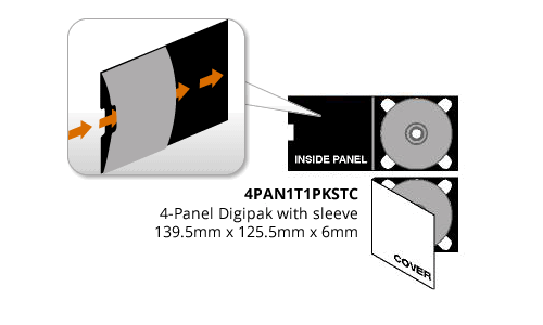
Inner :
Digipaks often fold out to show inner panels that can contain artwork, liner notes, lyrics, and other disc-related information.
The disc tray is the compartment in which the CD or DVD is kept in place. It is often found on the inside right panel of the digipak and is constructed of plastic or other materials.
Back Cover:
A digipak's back cover often includes information such as a track listing, copyright information, production credits, and contact information for the artist or record label.
Booklet:
Some digipaks include a booklet that contains more information on the album or DVD, such as lyrics, images, and other supplementary material.
CONVENTIONS OF A DIGIPAK FOR THE INDIE GENRE:
The customs of an indie digipak may vary based on the artist or album, but they often represent the DIY and independent attitude of the indie music movement.
Indie digipaks frequently have a homemade or DIY look that represents the artist's independent ethos. Hand-drawn artwork, screen-printed graphics, or other customised elements give the package a distinct and authentic sense.
Minimalist design:
Several independent musicians use minimalistic images and text to represent their modest and stripped-down sound.
Eco-friendly materials:
Independent artists may opt to utilise eco-friendly materials such as recycled cardboard or paper for their digipaks to demonstrate their dedication to sustainability.
Independent musicians frequently put unique information in their digipaks, such as handwritten lyrics, personal images, or letters to fans, to develop a stronger connection with their audience.
HOW DOES A DIGIPAK LINK TO THE MUSIC INDUSTRY ? :
Marketing and branding connect the digipak to the music industry: A well-designed digipak may aid in the promotion of an artist or record by delivering a distinct and memorable packaging experience that stands out on store shelves or online marketplaces. Digipaks commonly incorporate artwork, photographs, and other branding elements that help an artist build their visual identity and promote their music to potential listeners. Another way it connects is how artists and record labels may profit from the sale of CDs, DVDs, or other digital media, in addition to digital downloads or streaming royalties, by creating a physical product.A digipak can be purchased through traditional retailers as well as internet markets such as Amazon, Bandcamp, and the artist's own website. Participation of fans: Having a physical copy of an album is an important part of many music lovers' engagement with an artist's music. A digipak may provide a physical and visually appealing way for listeners to connect with an album by incorporating liner notes, lyrics, and other added information that enhances the listening experience. Finally, a digipak is a valuable tool for the music industry since it allows for the development of a tangible product that can be promoted, sold, and delivered to customers while also improving the overall listening experience.

DIGIPAK INSPIRATION & PLANNING
This section is all about the layout, colour pallet and inspiration that I have and will use to compose the final result for the Digipak.

01
Ben Howard
Ben Howard is the original artist of my chosen song and created this mood board to start looking into his photographs to understand his intended ideology as the meaning of his lyrics can be very abstract and ambiguous.
02
Clairo
Clairo is an Indie/ alternative artist that I decided to research to find out the way they communicate meaning with their specific codes and conventions.
.png)
.png)
03
Boy Pablo
Soy Pablo is another Indie/ alternative artist that caught my attention as he created many photoshopped pictures with a vintage vibe, giving a very good idea as they normally include in their Instagram posts many old photographs of the artist when they were younger.
04
Ben Howard Digipak
The release of the album ' I forget where we' have a contrast in the cover and lyrics of his other albums, this is why I decided to research and get inspired by his original album cover. We can see how he only uses monochromatic color pallets giving the idea that his life is draining him as it seems detached from reality.
.png)
.png)
05
James Blake
James Blake is another inspiration that I chose to investigate for my digipak as he has a very ambiguous style of music and representation of his music, similar to Ben Howard.
DIGIPAK ANALYSIS 1


Son lux is a group of alternative indie music that only creates vinyl CDs as its target audience is mainly an older audience( 18- 25). This means it is essential to capture their audiences attentions with the cover as it dosent have the capabilities to add various photos in different sections.
As we can see on the front cover it is a very simplistic photograph and the only writing is the group name. This creates an effect of intrigue in the audience to listen to what the album is about. The black background and the circle in the middle could make reference to the nighttime and how at this time is when a condition of obscurity overcomes you. The typography of the cover is simplistic and basic in a shiny black to make it stand out just enough. This once again is to convey to an older audience as they tend to prefer a deeper meaning were they can feel identified and reflect on.
DIGIPAK ANALYSIS 2

This is a very ambiguous cover as it uses a variety of blue shadows foreshadowing the sadness that the consumer will experience when listening to the album. This idea of identification and non-mainstream music will target older teenagers from a ranging age of 18-25 and the idea of finding themselves while defying the usual music standards. Also, having only the artist's name on the front cover gives a sense of intrigue to find out what is the album about. This has developed my future decisions and conventions that I will be using for my digipak.

PHOTOSHOOT & COLOUR THEORY


This is the end product of my photo session; I like to think I successfully conveyed a sense of isolation and introspection. I zeroed down on the lighting style in an effort to mimic the enigmatic atmosphere the artist evoked. Following this, I will experiment with other color schemes in the selected pictures to see which one yields the most accurate result in regard to the genre.

Since I was drawing inspiration from many different artist, I opted to use a wide range of color schemes. This was the first palette I tried, based on the work of Clairo; I wasn't thrilled with it since it didn't convey a very intense feeling or even a feeling of isolation, so I shifted my attention to the many shades of blue with which I want to work.
Against the stark blackness of the backdrop, the photo's stronger highlights suggest that the subject is staring at something that will ultimately rescue him from himself.
This picture has previously been modified to make it seem like there are many people in it, by layering their faces several times so that you can't see any individual features. This furthers the assumption that he is subconsciously set apart from the rest of society since neither he nor they have a firm grasp on who he really is.


During a rainstorm, this picture was taken. With this picture, I was going for a moody, foreboding tone to represent the artist's mood and the emotions he's trying to convey. My intention was to emphasise the feeling of loneliness and minimalism conveyed by the song's performer, so I filtered all the photos with a black and white filter.
For this close-up photograph, I opted for a chiaroscuro treatment. Putting the artist's face in the spotlight by contrasting bright areas with dark ones. This heightens the impact of the audience's admiration of his face and, in certain cases, may even convey a feeling of intimidation.
I opted to go with cool tones, but I used a pretty green filter for this photograph, and I'm not persuaded. The reason for this is because green has more overtones of contempt and jealousy and does not convey the artist's desired message or ideology.


I altered the original tones of red and yellow to a more calming blue and green and included a photo from the artist's early years. The goal here is to evoke feelings of longing for simpler times when things were different in his life, As a means of contrast on who they are and what has conditioned them to be and behave this way, many alternative / indie artists upload a photo of themselves when they were small.

Ultimately, I settled on editing the majority of the shot in blue and green lighting, as I felt that this would provide a more nuanced and open interpretation for the viewer. Darker colour palettes associated with a "old teenager" in his twenties might evoke feelings of nostalgia and familiarity in the buyer. This, I believe, is the best photographic option for reaching this demographic.

TYPOGRAPHY & LAYOUTS
1) JUSTIN CHANDLER
2) JUSTIN CHANDLER
3) JUSTIN CHANDLER
For the digipak, these were the three most prominent typefaces I tried. This is due to the fact that they are very easy to read and comprehend. The artist is making an effort to convey some profound message about himself, but he is not doing it via intricate arrangements of things. Artist's primary demographic consists of millennials. This is because adolescence is a period of independent self-discovery and, therefore, a time of increased reflection during which many previously undetected issues become apparent.

1

2

3
Having the three layouts for the image I wish to put on the front cover, has led me to conclude that option 2 is the best. This is because it is integrated very quietly into the photograph's arrangement, without distracting from the primary subject. In contrast, choice 1 is shown in close proximity to one another in strong lettering, making the viewer feel overwhelmed by the font's intensity. Option 3 might alternatively be considered a serif font with traditional and formal overtones. The target audience for this song consists mostly of young people who are in the process of becoming more self-aware via education and professional experience; yet, they are not yet completely mature, which may create viewer indifference. My final digipack design will feature a simple typeface because I feel this best conveys the indie genre, which is typically fairly low-budget in compared to popular pop music. And the people that listen to indie music are looking for something intentionally vague so that they may read their own meaning into it. So, I believe that having simple, thin font will entice my target audience to give the record a spin.


This is the first layout I chose for the digital package. On the front cover I opted both a plain image and typography, with the album name on a little piece to the right, to focus yourself largely on the artist. On the back I opted to follow the simplicity of the front cover and picked a black backdrop that has connotations of mystery, to generate more suspense to the spectator and desire to listen to the record. I included the album songs so the audience may have rapid grasp of the albums concept by the titles of the songs. In the bottom left of the back cover, I placed instagram, twitter and YouTube with a hashtag, the objective for this is to highlight that you can discover the artist accessible via these channels and learn more about him. the recognition of the production firm is to establish awareness from prior song releases by this company and demonstrate the quality of the song. ultimately , for the interior half of the digipak I chose for a more complicated shot, following the grey colour pallette, generating additional mystery and tension about the record.

In my second attempt, I've chosen to preserve the front cover while modifying the back cover. Previously, I had included the production company's name on the back cover; however, I deemed it irrelevant and overbearing on the cover since it was too much needless information. Next, I replaced the white backdrop where the CD would be with a black background to reduce the contrast between the dark colours and the white background. White might have sent the incorrect meanings since it emphasises the concept of purity and calm, which is contrary to the aim of the song. I chose this shot on the inside of the CD because it conveys the sense that the artist is engaging in self-reflection and attempting to better understand himself, hence arousing audience interest.


In this last test, I decided to alter the hashtag on the back cover to make it more viral and shareable by the audience. Additionally, I altered the inner cover to a scene from the particular music video and a monochrome image that better suited the genre.

Many album covers of trip hop music are heavily centred on the featured musician. This will be accomplished by placing just a little amount of text on the front cover, allowing the title of the album and the artist's name to take centre stage.
MAIN IMAGE
In this last test, I decided to alter the hashtag on the back cover to make it more viral and shareable by the audience. Additionally, I altered the inner cover to a scene from the particular music video and a monochrome image that better suited the genre.
SIMPLICITY
The minimalism of the record cover reveals very little information. Audiences are persuaded to listen to an album when they are uncertain about its contents.

IMAGE EFFECTS
It is clear that the image of Justin Chandler has undergone some kind of digital manipulation in order to get the desired illusion of having three faces. The foggy picture and lack of definiteness are able to attract viewers and veil his ambiguities, both of which are things that are regularly found on album covers of the trip hop genre. It's possible that the obscurity of the cover art is meant to represent the unpredictability of trip hop and the experimental nature of the genre.
The use of the triple person makes Justin Chandler look almost spectral, which dehumanises him and may be an accurate reflection of the profoundly mournful tone of his voice. It is usual for artists to desire to look distinct to their audiences. This is because being different may be exciting, which is what pulls listeners in. Additionally, Justin Chandler's singular look may be a reflection of his singular musical approach, as well as, on a larger scale, the singularity that is represented by the genre of trip hop.
COLOUR SCHEME
James Chandler seems somewhat distant and apart from the audience due to the hue created by the colour scheme . This divide between the artist and the consumer might be appealing to audiences who want to learn more about the artist.
TITLE
The only writing that can be seen on the album cover is the name of the artist and the name of the album, which can be found in a little corner of the cover. Once again, this guarantees that the cover is centred on the artist and enables consumers to recognise the album as one that was created by Justin Chandler.


During this final process, I decided to finally only change the QR code that links directly to the website of the artist where the consumers can see the store and buy the merch, the music video, buy the digipack, and tour tickets. This creates a direct link between the video and social media due to the hashtags used and symbols showing on which platforms it's available.